
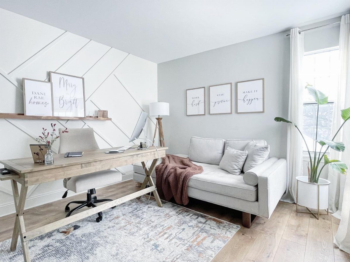
The colors here range from soft neutral whites and beiges that open up tight quarters to deep navy and green tones that bring focus to a dedicated workspace, plus guidance on lighting and finish once you pick.
Your choice hinges on the room’s natural light and the kind of work you do most: blue and green support focus for analytical tasks, yellow sparks creative thinking, and neutrals keep the space flexible when your projects shift.
1. Gray
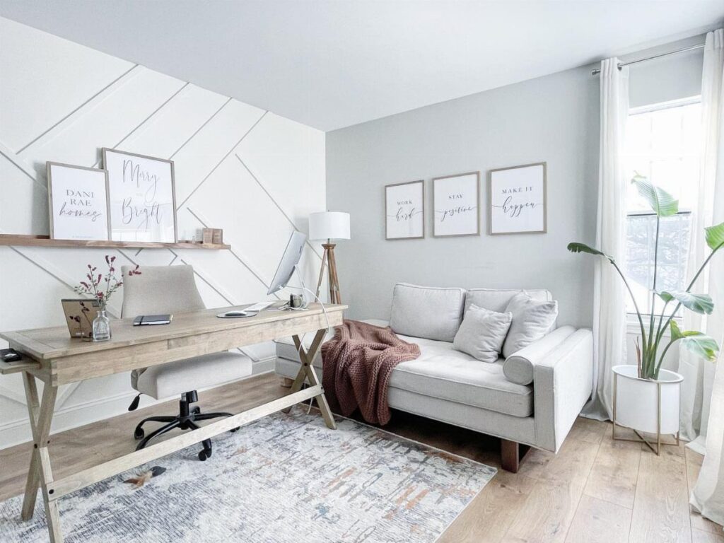
Gray walls give you a neutral base that adapts to any desk setup or shelving. The tone lands somewhere between stark white and heavy dark colors, so the room feels focused without closing in.
I like gray for small home offices where you want the walls to recede. It pairs well with wood furniture and keeps attention on your work surface instead of the perimeter.
If your office gets limited natural light, stick to lighter grays to avoid a cave feeling.
2. Green
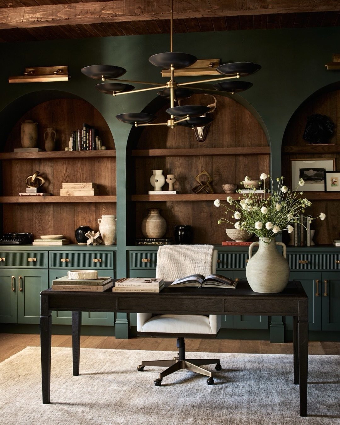
Dark green walls bring a grounded, library-like calm that helps concentration without feeling clinical. The color creates a cocooning effect that works well in rooms where you spend long stretches.
Pair green with warm wood tones and brass or gold hardware to keep the space from reading cold. Natural light helps, but the color also handles artificial light well if you add a warm bulb temperature around 2700K.
Green hides scuffs and marks better than white, a practical advantage in high-traffic home offices.
3. White
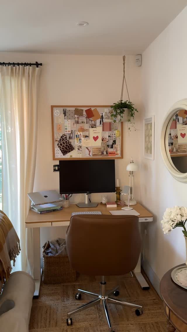
White walls open up tight spaces and reflect light to every corner, making small home offices feel twice their actual square footage.
The color keeps the focus on your desk and whatever you pin to a mood board or hang as art.
White needs good natural light and gains warmth through wood furniture or textiles. Without those, the room can feel sterile.
I choose white when the office doubles as a guest room or sits in a pass-through area where a darker color would shrink the adjoining hallway.
4. Bold Color Accent Wall
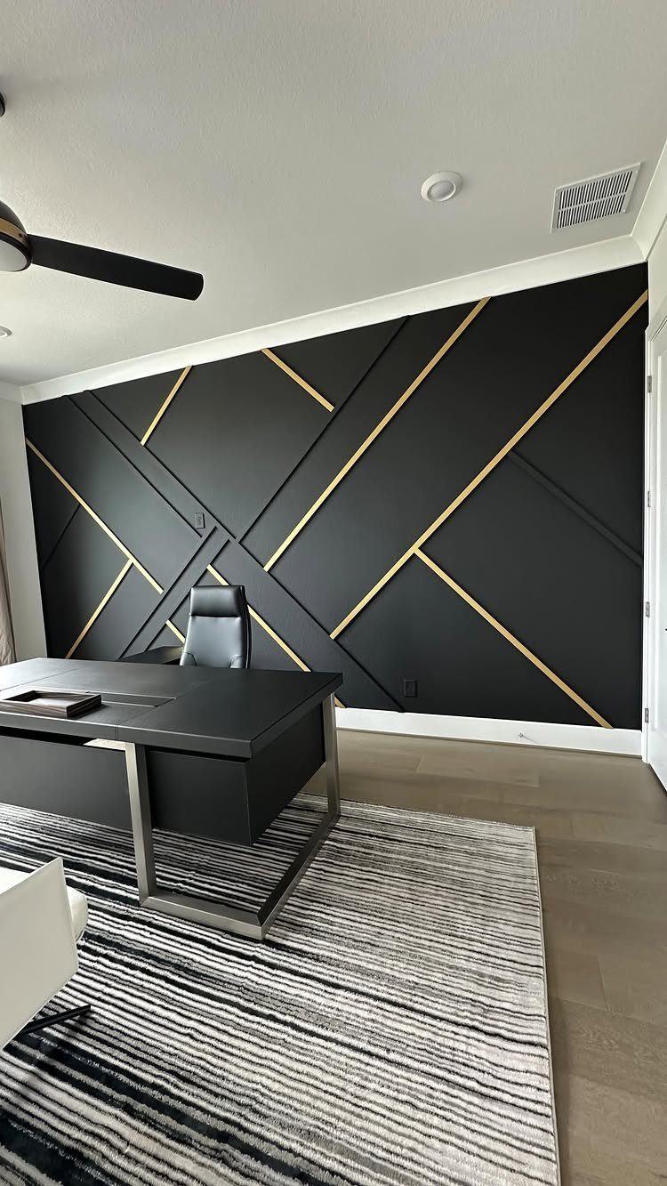
A bold accent wall in black, deep navy, or saturated jewel tones gives the room one strong focal point while leaving the other three walls neutral.
The contrast draws your eye to the desk wall and creates a backdrop that makes shelving or framed credentials pop.
Gold or metallic trim adds dimension without requiring wallpaper or complicated patterns. The technique works in offices with good ceiling height; in shorter rooms, a bold wall can press down.
Keep the desk and chair simple so the wall stays the statement piece.
5. Earthy Terracotta
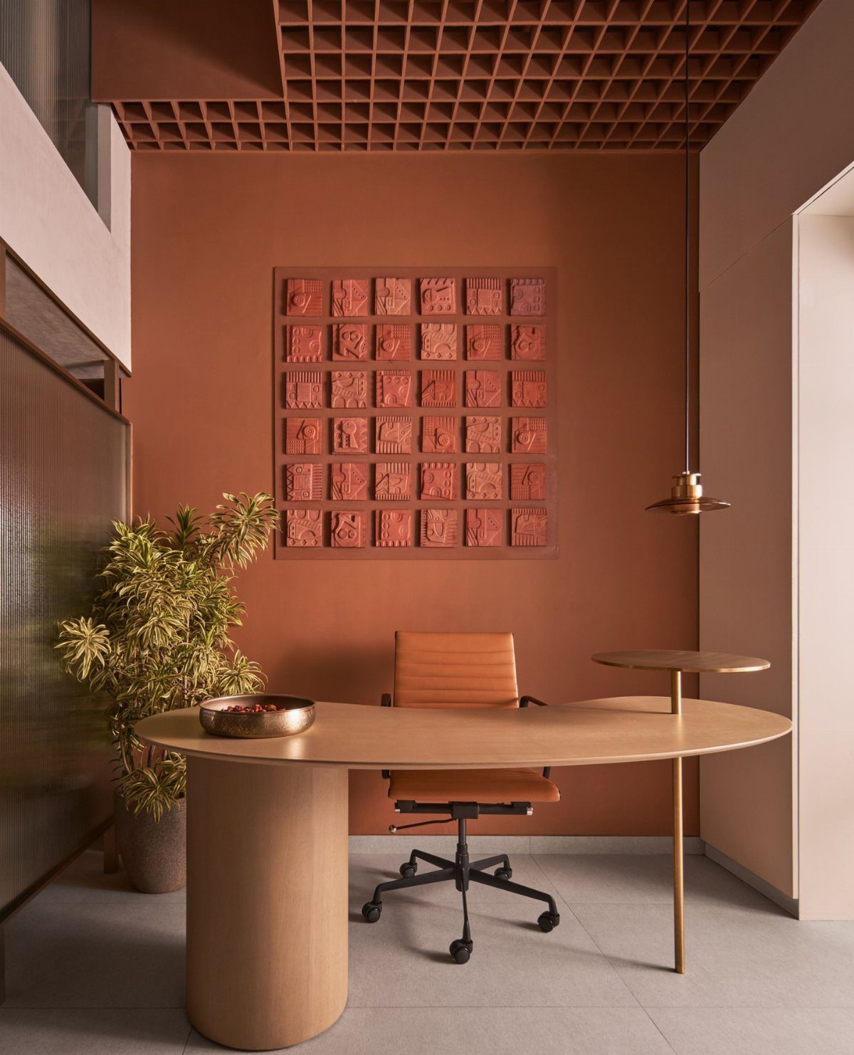
Terracotta walls wrap the room in a warm, earthy tone that reads as sophisticated without tipping into overly trendy territory. The color sits between orange and brown, grounding the space in a way that beige cannot quite match.
I choose terracotta when the office has cooler light or faces north, since the warm undertones counteract the blue cast. Pair it with light wood and leather seating to lean into the natural material palette.
The color works in both small and large offices but needs white trim to keep edges crisp.
6. Beige
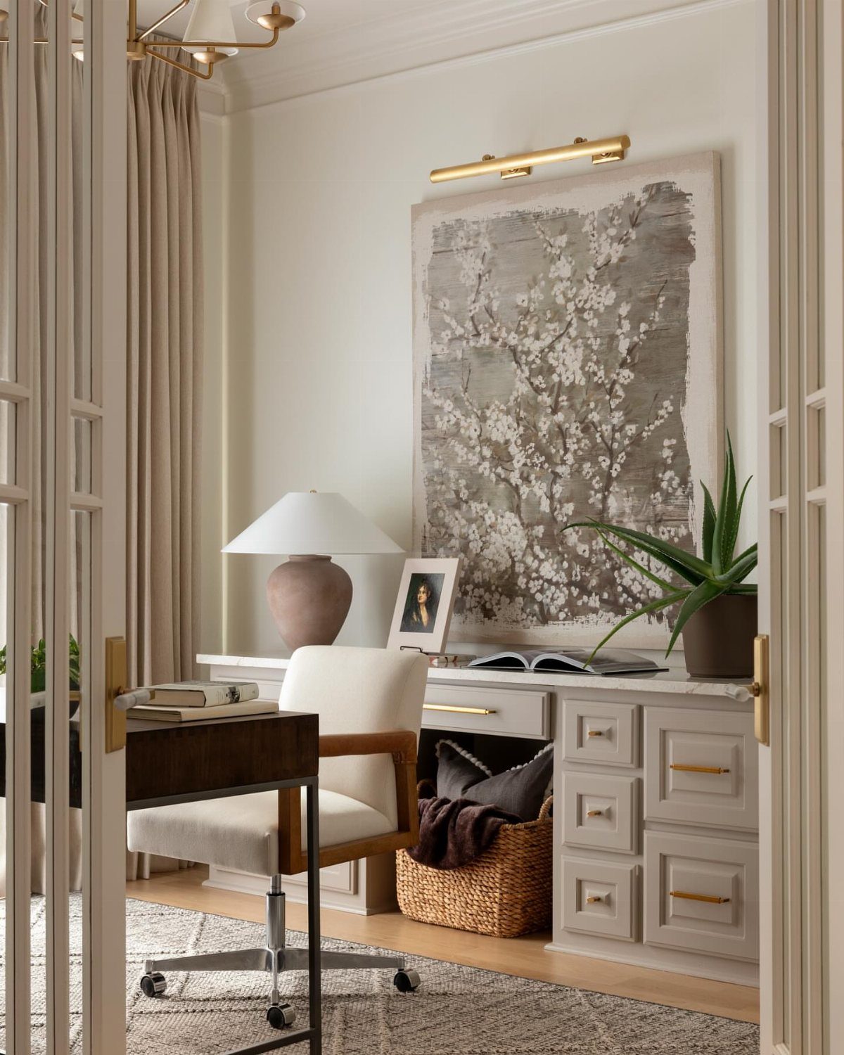
Beige walls create a soft, warm envelope that feels less stark than white but still opens up the room. The color works well in home offices that double as reading nooks or creative spaces where you want a relaxed mood.
Beige suits rooms with oak or pine furniture and pairs naturally with cream, tan, and soft gray accents. It hides minor wall imperfections better than bright white and does not show shadows as harshly.
I pick beige when the office sits off a living area and needs to blend rather than stand out.
7. Navy Blue
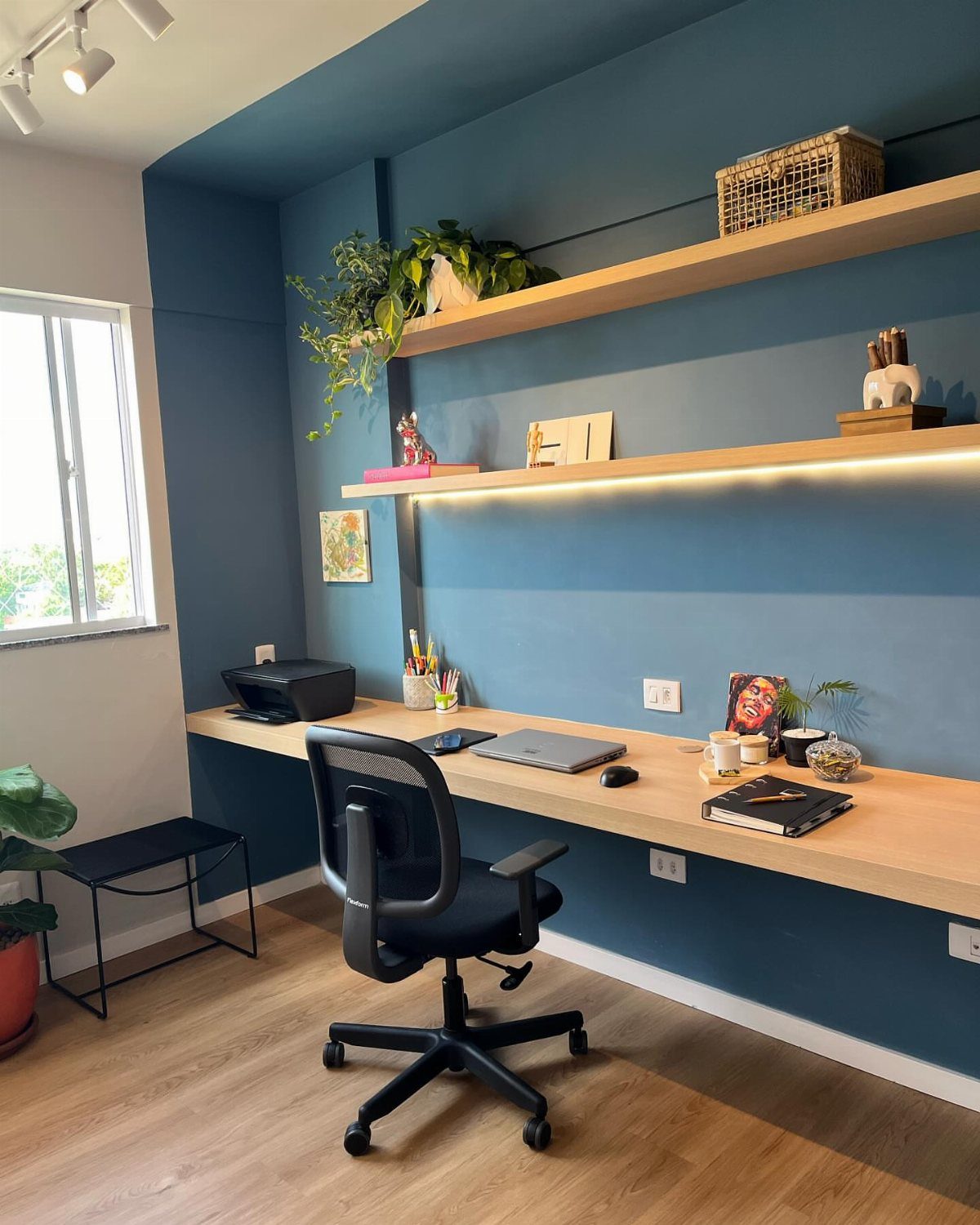
Navy blue walls bring a professional weight to a home office without the stiffness of gray. The color reads as intentional and grounded, which helps when you take calls or need the room to feel like a real workspace.
Pair navy with light wood to keep the room from feeling too heavy. White trim sharpens the edges and prevents the color from bleeding into doorways.
Navy suits offices with decent natural light or strong overhead fixtures. In dim rooms, the walls absorb too much and the space can feel smaller than it is.
8. Farrow and Ball Lichen
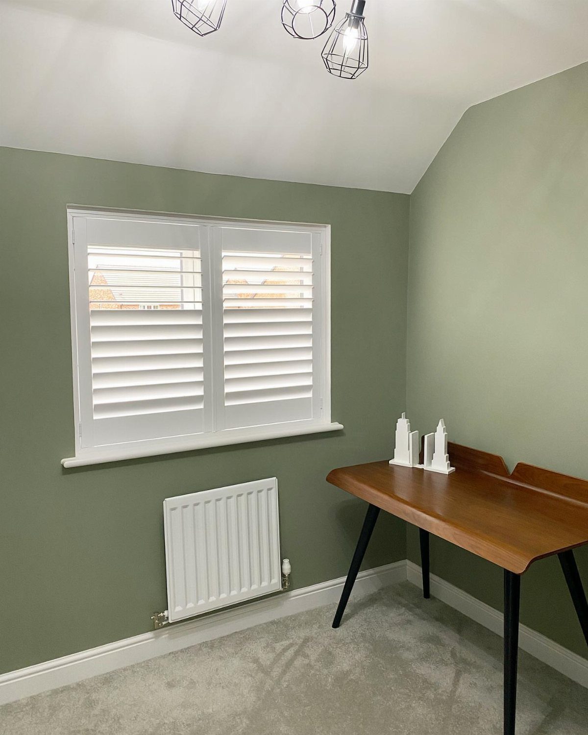
Lichen from Farrow and Ball sits between gray and green, a muted sage that brings outdoor calm into a working space.
The color feels softer than true green and less clinical than gray, landing in a middle zone that stays easy on the eyes through long hours.
The tone works well with white millwork and natural wood furniture. It reads warm in daylight and holds up under task lighting without shifting too yellow.
Lichen costs more than standard paint, but the pigment density means better coverage in 2 coats.
9. Sherwin Williams Creamy
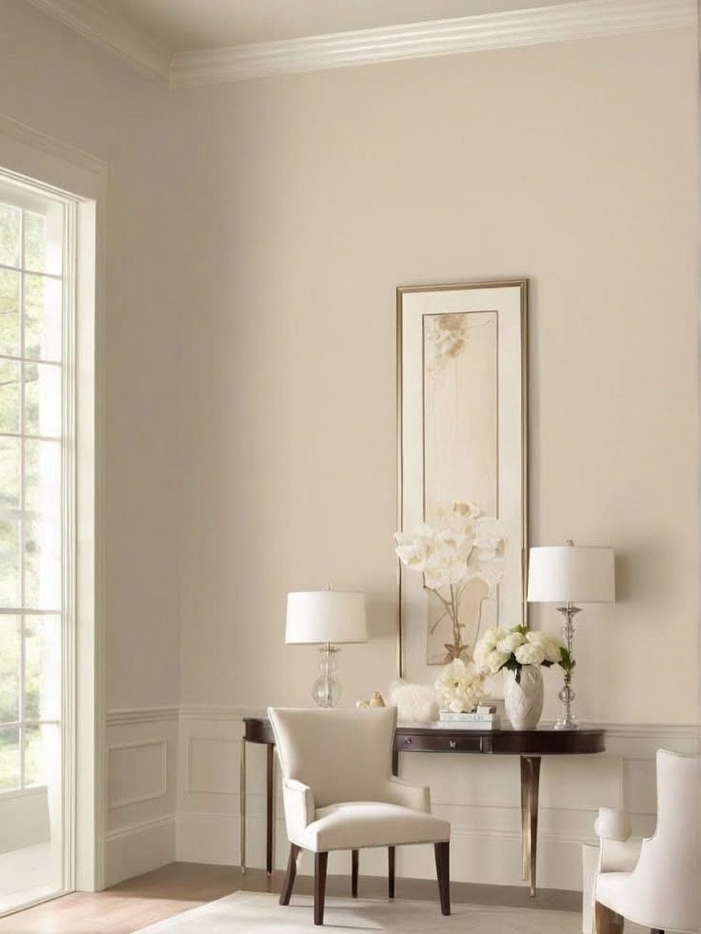
Sherwin Williams Creamy is a warmer take on white, an off-white with enough yellow undertone to soften the room without reading as beige.
The color opens up tight spaces the way true white does but feels gentler in rooms with warm wood or brass fixtures.
Creamy works in offices that need to stay bright but want to avoid the stark, clinical look of pure white. It pairs well with darker furniture and hides minor wall flaws better than cooler whites.
The color stays neutral enough to work as a backdrop for bold art or shelving.
10. Dark Brown Wood Paneling
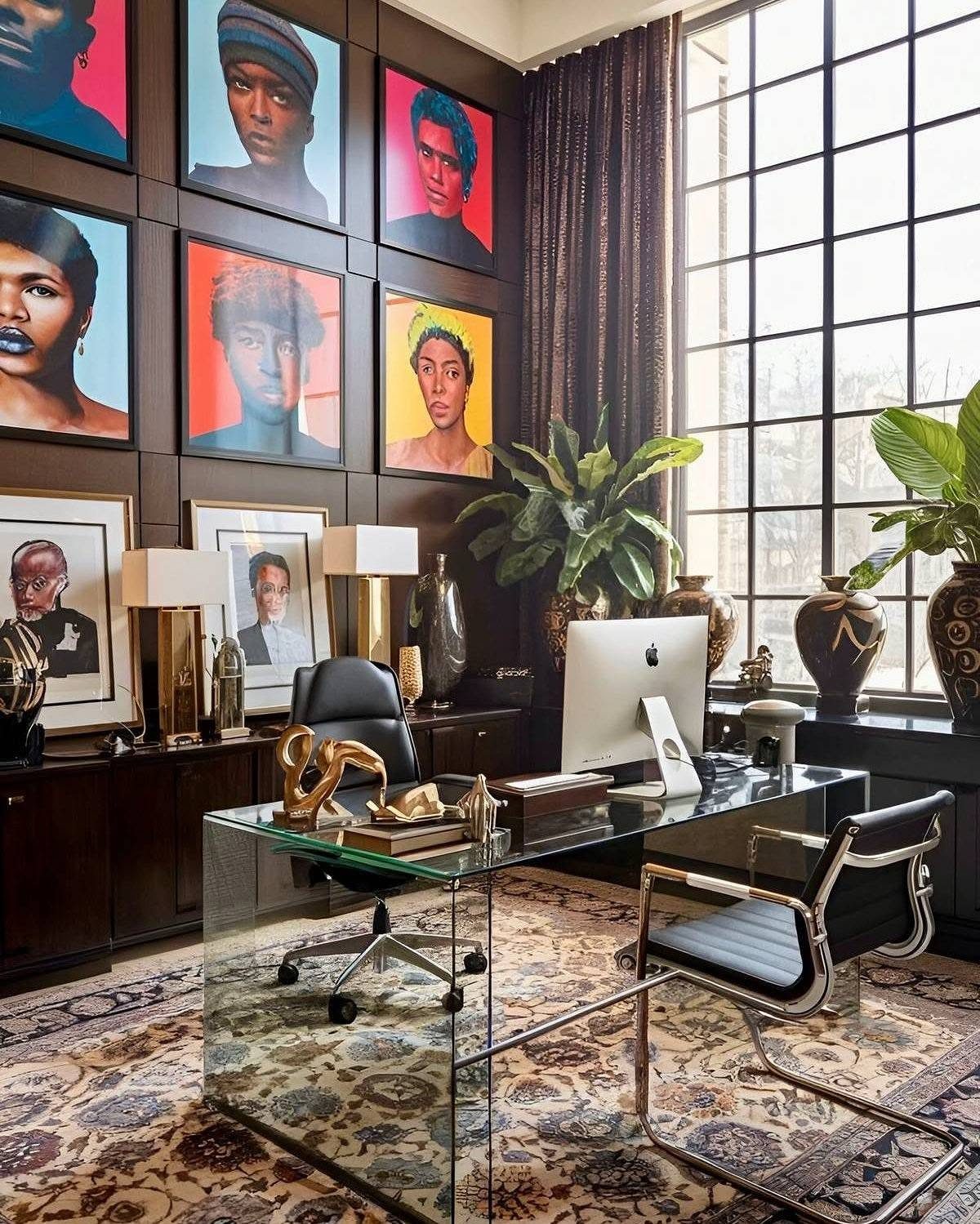
Dark brown wood paneling wraps the room in a rich, library-like finish that feels more substantial than painted drywall.
The material adds texture and depth, and it holds up to daily wear without showing scuffs or marks the way lighter walls do.
Real wood paneling costs more and requires trim work, but it gives the office a custom look that paint cannot match.
Paneling suits offices with high ceilings or strong natural light. In smaller or darker rooms, limit it to one accent wall.
Color Psychology
Blue and green tones calm the mind and support focus over long stretches, which explains why they appear so often in professional settings.
Yellow lifts mood and sparks creative thinking, making it a solid pick for design work or writing spaces where ideas need room to develop.
Red pushes energy up but can feel too urgent for extended concentration. Most people find it uncomfortable in a room where they sit for hours.
Neutral tones like gray, beige, and white keep distractions low and let the work itself hold your attention. I pick them when the office needs to stay flexible or when bold color anywhere else in the house already commands attention.
Match the color to the kind of work you do most. Analytical tasks lean on blue, creative projects benefit from yellow, and balance across different work types calls for green or a soft neutral.
Lighting Considerations
Cool light shifts wall colors toward blue and gray, while warm light pulls them toward yellow and orange. The gap between morning sunlight and evening overhead fixtures can make the same paint read like 2 different choices.
Swatch your top picks on the wall or on poster board and check them at different times of day before committing.
A color that looks calm in afternoon light can feel flat or dingy once the sun drops and you switch to artificial sources.
I keep samples up so I see them in both strong and dim light before I decide. Skipping this step means repainting when the color lands wrong under the lights you actually use.
Choosing the Right Finish
Eggshell finish gives home office walls a low sheen that hides minor flaws without reflecting glare off a screen. Flat works if you want zero shine, but eggshell cleans more easily when the wall picks up fingerprints or scuffs.
Satin and semi-gloss reflect too much light in a workspace and highlight every imperfection in the drywall. Save those finishes for trim and doors where durability matters more than a soft look.
Frequently Asked Questions
What color should office walls be?
Blue and green keep you focused during long work sessions, while yellow brightens mood and supports creative tasks. Gray, beige, and white hold back and give your work the spotlight.
Match the color to what you do most: analytical work calls for blue, creative projects lean on yellow, and mixed tasks do well with green or a soft neutral.
What are some Sherwin-Williams accent wall colors?
Deep navy, black, and saturated jewel tones work as accent walls when you want one strong focal point behind your desk.
Sherwin Williams Creamy serves as a warmer neutral base that opens up the room without the clinical look of pure white. The bold options need neutral walls on the other 3 sides so the contrast stays sharp.
Which is the best paint for office?
Blue and green calm the mind and support extended focus, making them reliable picks for offices where you spend hours at a time.
Those 2 colors fit any furniture or shelving layout you already own. Navy blue and dark green add professional weight, while terracotta and beige warm up rooms with cooler natural light.